A page can look attractive and load quickly while a visitor cannot reach its button using a keyboard, another cannot understand instructions provided only in an image, and someone else cannot follow a video without text. Digital accessibility begins with a practical question: can people using different ways of interacting complete the intended task?
This guide offers an organized starting point for a content creator, website owner, or small team. It does not provide a compliance certificate or replace specialist assessment and user involvement. A simple fictional task will help us identify barriers and write an actionable report without claiming that a quick review covers every need.
Start with a task, not a collection of icons
Choose a realistic task, such as finding a guide, reading its instructions, or sending a question through a test form. State the starting point and expected outcome. “Visit the website” is broad; “find the guide link, open it, and understand the first step” defines a path you can review.
W3C's resources on how disabled people use the web introduce diverse needs, tools, and barriers. Do not reduce the audience to one user or assume one person's experience represents everyone. Use that diversity to broaden the questions you ask about the task.
Our hypothetical example is a community organization with an activities page and a button for requesting details. The goal is not to add decorative features. A visitor should find an activity, understand its date, reach the request function, and understand the result. We will review that path without sending a real request or using personal information.
Define the review's scope and limits
Record the pages, language, device, browser, and date. If you tested one page on a computer, say so. Do not describe the whole site as accessible to everyone after that single exercise. The result covers only the conditions examined; other pages and states may contain barriers.
W3C's preliminary checks explain that quick checks cover limited issues and are not a comprehensive evaluation. They are a learning starting point, not a substitute for broader work. Both references in this article come from the same organization; they are not presented as independent studies.
On a site you do not control, limit yourself to ordinary authorized interaction. Do not submit fake enquiries or create orders to test the interface. Request a test environment or the responsible person's assistance when a step could have a real-world effect.
Review navigation one step at a time
On the test page, attempt the task using the keyboard rather than relying on clicking. Observe where focus moves and whether you can visually identify the selected element. Record the exact point at which progress stops instead of writing only that navigation feels difficult.
A useful hypothetical report says: “After the activity link, focus moves to the page footer; I did not reach the details button along the tested path.” Someone else can repeat that observation. “The keyboard does not work” may be too broad to tell a developer where to start.
Do not change someone else's settings or assistive technology merely to make a test pass. If you are unfamiliar with a screen reader, do not present a brief attempt as the experience of a skilled user. Learn the tool or involve appropriate expertise, describing your test honestly.
Review reading and meaning
Read as someone trying to complete the task rather than as its author. Does the title explain the subject? Do headings help locate what matters? Is “Registration details” clearer in context than several links all labelled “Click here”?
Consider important images: what information do they add? If the event date appears only on a poster, consider providing it as understandable text in the content too. If an image is merely decorative, do not invent a lengthy explanation that distracts from the task. Decide its role before writing its description.
In the community example, an organized passage with the activity name, date, and enquiry route could be clearer than distributing those details across a poster, photograph, and unnamed button. This is an editorial suggestion for the example, not a compulsory layout for every page.
Try the display at a useful size
Change zoom using the browser's usual control and record the level tested. Check whether instructions and controls remain usable or disappear behind another element. Visible text alone is not a successful outcome if the button required to complete the task becomes inaccessible.
When reviewing color, ask whether information is conveyed only by a particular color. A fictional instruction saying “red fields are required” leaves a gap for someone who cannot distinguish that signal. Clear wording can help explain the task, while technical contrast assessment requires appropriate measurement rather than a quick visual impression.
This article does not list compliance thresholds or legal requirements. If you need to demonstrate conformance to a particular standard, agree on its version, level, and scope with a specialist and report against those requirements. Do not turn this introductory walkthrough into a certificate.
Check forms and media in a safe environment
For a test form, examine field names, instructions, error messages, and success feedback. Can a user understand what needs correction and return to it? A red box without an explanation does not communicate the problem adequately.
Play an appropriate test clip and consider whether its useful information is available to someone who does not rely on audio alone. A captions button does not establish that the text is accurate. Review a sample of the spoken content, especially names and important instructions. Do not publish unintelligible automatic text simply to tick a box.
If movement continues on screen, record its effect on reading the task and the controls offered. Do not ask someone to endure a display that causes discomfort. Participation in a review should be voluntary and clearly defined.
Write a report the team can use
| Field | Information to include |
|---|---|
| Task | What was the user trying to accomplish? |
| Context | Page, language, device, browser, and date |
| Observation steps | What happened before the barrier appeared? |
| Expected outcome | A meaningful result tied to the task |
| Actual outcome | What appeared or could not be done, without guessing the cause |
| Impact | Did it prevent completion, make it harder, or obscure instructions? |
| Follow-up | Who will investigate, fix, and retest it? |
Remove private information from screenshots. Do not rely on a screenshot alone to explain a barrier: include a written description and repeatable steps. A good report reduces the time needed to understand the issue and keeps discussion focused on the task rather than personal design preferences.
Prioritize according to the barrier's impact
Start with obstacles that prevent the main task, then those causing errors or substantial confusion. An unreachable button may be more urgent than a cosmetic improvement on a secondary page. This prioritization should organize responsibility and effort, not erase the remaining issues.
After a change, repeat the same steps and record the difference. Then inspect similar locations that may use the same component. Fixing one page does not establish that every version and language is fixed, especially where wording, menus, or element order differs.
Involve users without assumptions
When people who use assistive technologies participate, explain the task, what will be recorded, and how observations will be used. Respect consent and privacy. Do not request diagnostic information you do not need or make one individual responsible for proving that an entire product is usable.
Combine user experience with specialist examination. A real task can reveal a barrier missed by a preliminary review, while technical investigation can find issues outside the tested path. Multiple forms of evidence are more useful than searching for a single score that removes the need for continued work.
Sources and limits
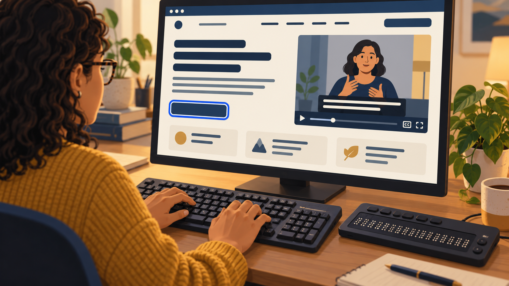
The linked W3C pages were read on 1 November 2026. The community scenario and report template are original. No specific website was audited and no conformance was established. The generated illustration shows a fictional interface, not a test result. This article was prepared with AI assistance and has not received independent human editorial review.