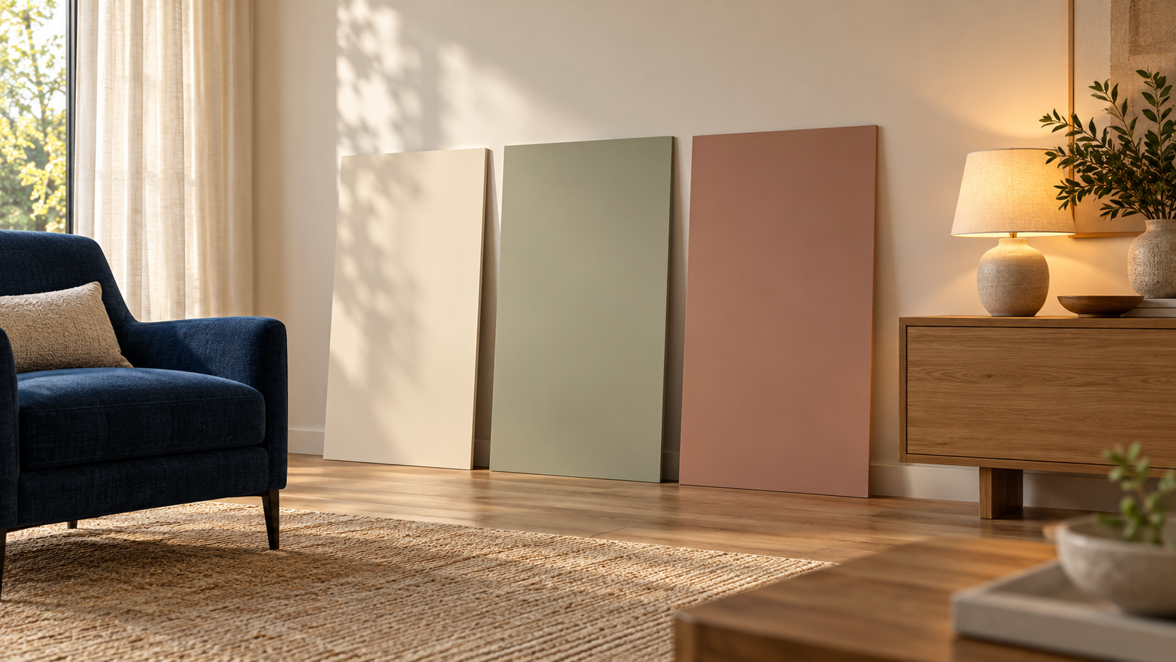
A colour chosen from an attractive photograph can look different beside your flooring and sofa under your own lighting. Coordinating a room is not about finding three names that always work together. It is about building a palette around existing elements and actual use, then checking it before committing to large surfaces or difficult-to-reverse purchases.
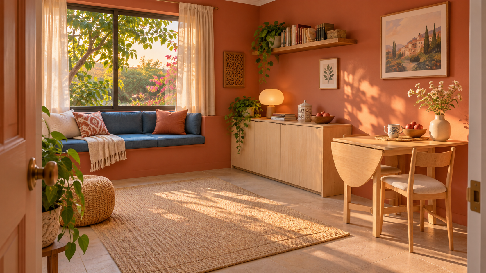
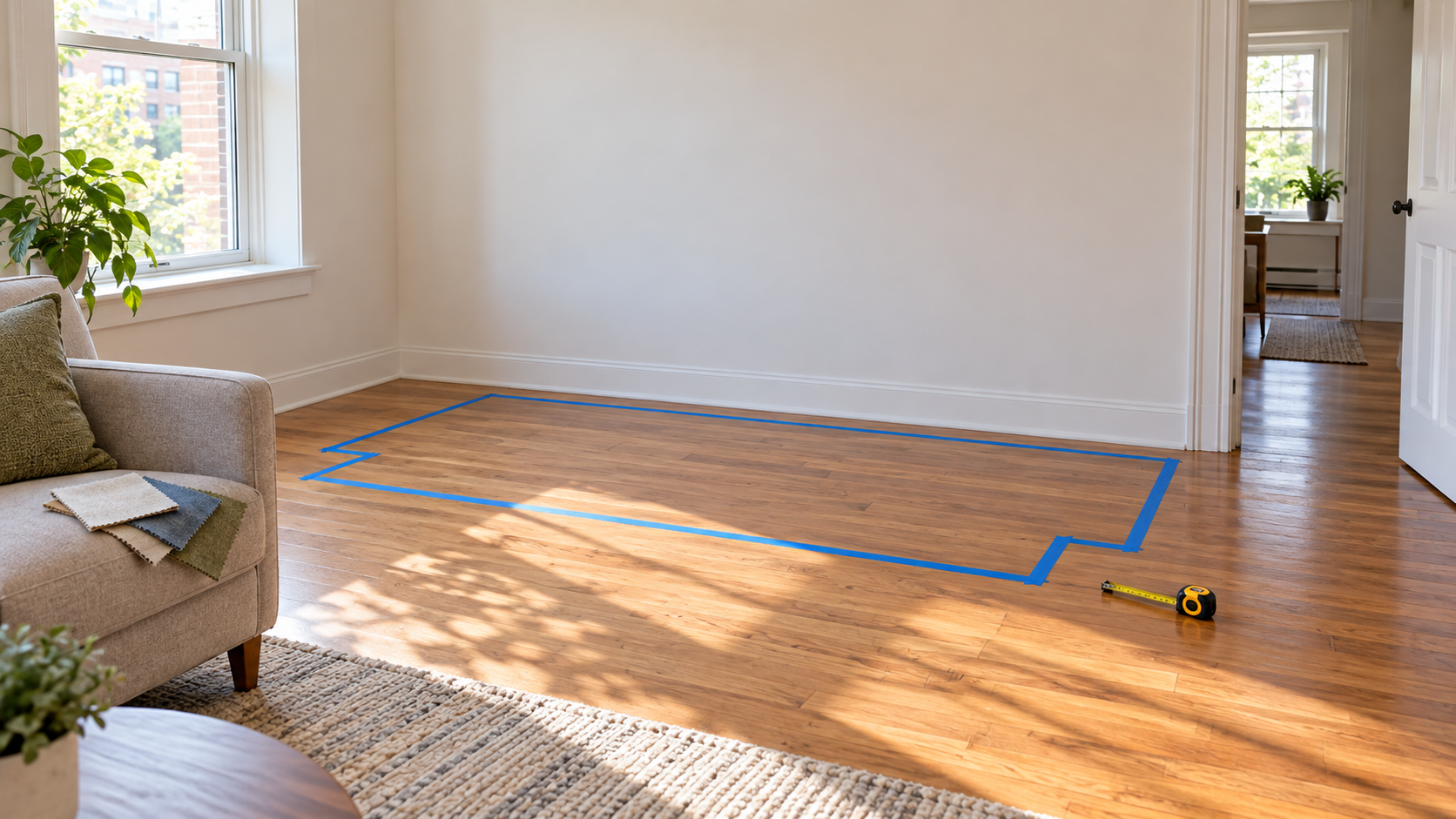
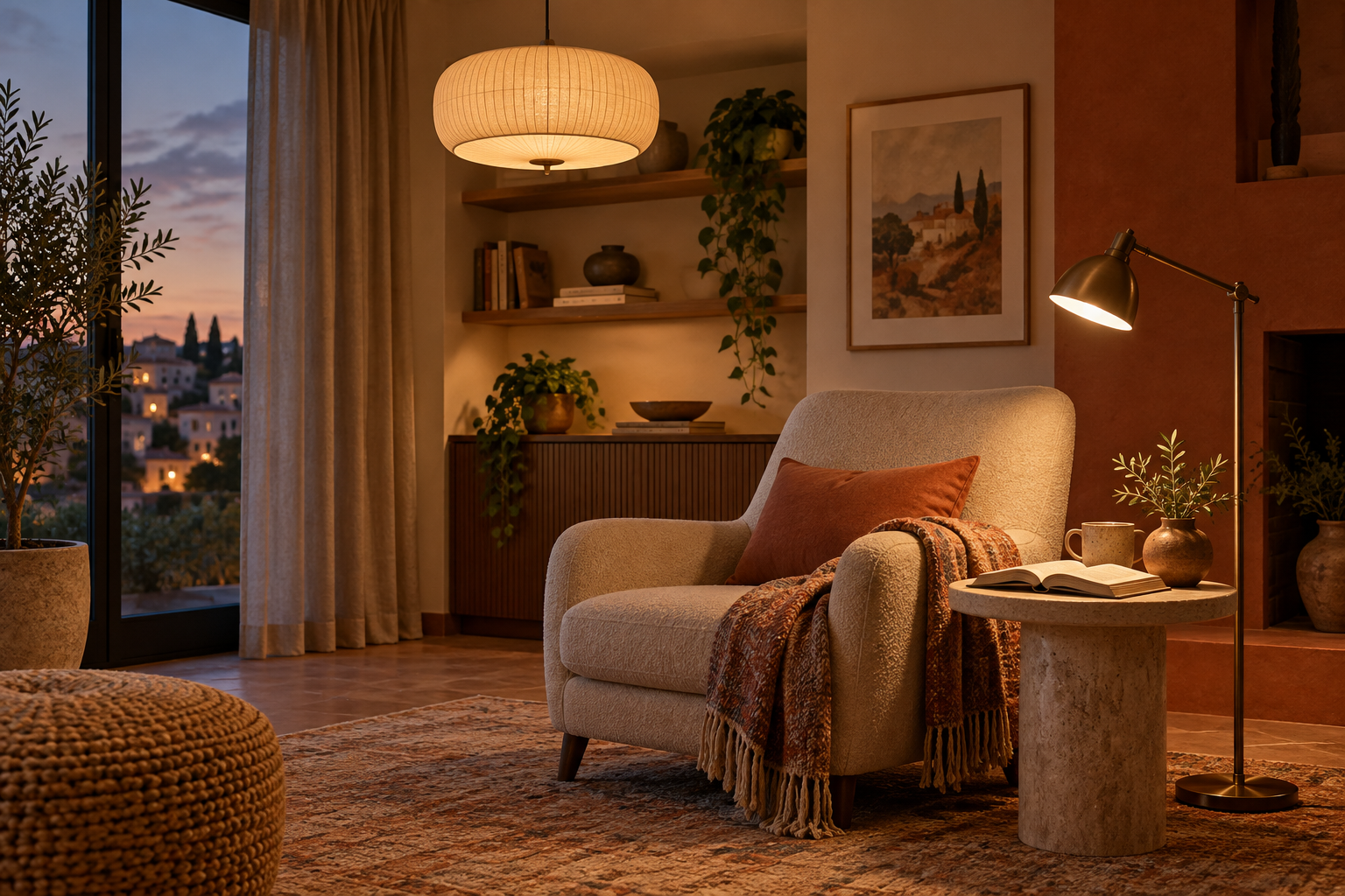
This is a practical comparison process, not a psychological formula promising that one colour makes everyone happy or calm. Examples are imaginary, and no commercial shade or product is recommended. The generated illustration demonstrates sampling; it is not a colour-accurate purchasing reference.
Begin with what will stay
List the flooring, doors, large furniture, and curtains you intend to retain. Start there rather than choosing paint in isolation and discovering that the remaining budget would need to replace perfectly usable items. Everything need not match; you need to see the actual combination you will live with.
Distinguish elements that are effectively fixed from small, easily changed ones. A whole wall or sofa is a different commitment from a cushion cover. Trying a favourite colour in a limited element can help you assess it without treating that small purchase as a promise to redesign the entire room.
Describe the result in observable terms
Instead of “make the room beautiful”, write what should change: fewer competing colours, more emphasis on an existing piece, or a visual link between two areas. Those aims are discussable. Claiming that a shade will make every family member more comfortable is unnecessary and is not established here.
Ask the room's users about specific preferences and objections. Someone present in the morning may see it differently from someone using it at night. Record that difference rather than arguing that one taste is scientifically correct. Shared and personal areas may offer flexibility where the room's use allows it.
Light is part of the appearance you assess
The Sherwin-Williams colour-and-light guide explains lighting effects and recommends viewing samples under different conditions.
The Benjamin Moore sampling guide describes movable samples for observing colour around the actual room.
Use those principles without expecting every lamp or space to produce the same effect. Follow the instructions for the particular sample product; do not assume a sample material is intended to finish the final painting project. This guide does not ask you to modify wiring or electrical fittings. Assess normal existing lighting, and leave technical changes to an appropriate professional.
Create a small palette with clear roles
Choose a limited initial set and assign each colour a role: broad background, an existing main element, or a smaller accent. A rigid percentage is not required. Windows, furniture, and patterns change the distribution. The useful question is whether everything competes for attention when that is not what you want.
An existing rug you like can provide a starting direction without requiring you to copy every colour in it. Write why each candidate belongs. If the only reason is “I saw it in another photograph”, reconsider its relationship to this room before expanding the list.
Separate a name from an actual appearance
“White” and “grey” do not identify single shades, and commercial names vary between suppliers. Keep the shade reference, product, and finish when discussing a purchase. An appealing name or screenshot is not a reliable way to reorder the same selection.
Compare samples beside room elements rather than judging them alone. Use straightforward observations: “This looks warmer beside the wood” or “The difference is more noticeable in the evening.” These are personal observations in a specific setting, not laboratory colour measurements.
Run an orderly comparison
Narrow the options before obtaining samples and identify them clearly. Position them safely according to their instructions and the surface requirements, without damage or obstruction. Do not improvise heavy hanging boards or unsafe fixings. A simple arrangement is enough for this exercise.
View them at times that reflect actual room use, not only under photogenic light. Keep conditions comparable between candidates where practical and record time, lighting, and neighbouring elements. A few clear notes may be more useful than dozens of photographs whose conditions you no longer remember.
| Option | Context | Observation | Next question |
|---|---|---|---|
| Sample A | Beside sofa in daylight | Fits the preferred combination | Check in evening use |
| Sample B | Beside curtain at night | Less distinction from background than expected | Reconsider its intended role |
| Sample C | Beside flooring | Users disagree | Compare a limited alternative |
A fictional room with retained elements
A household has a dark-blue sofa, wood flooring, and cream curtains it wants to keep. Three wall candidates are proposed: a light warm shade, a muted green direction, and a subdued clay direction. These are broad descriptions, not product names or a formula guaranteeing a particular result.
The household views samples beside the sofa and flooring. One appeals in daylight but does not provide the desired contrast during normal evening use. Rather than declaring the colour “bad”, they record that it does not fulfil the intended role in this context and compare the remaining candidates under similar conditions.
They might retain a simple background and introduce clay in a small item, or select another background after sampling. There is no compulsory ending. The value lies in moving from inspiration to a specific comparison while retaining furniture they like and avoiding premature replacement purchases.
Include patterns and materials
A patterned rug or curtain is not merely one colour. Consider the pattern's scale, repetition, and position, then decide whether to add another pattern or keep nearby elements simpler. No rule here prohibits combining them; the aim is an intentional choice.
Similar-looking colours may appear differently on cloth, paint, and glossy surfaces. Numerical matching between different materials is not the objective, nor does one screen code establish identical results everywhere. Request physical samples where matching is important to the decision.
Phone photographs are reminders, not matching standards
Use pictures to record sample arrangements and references, not to prove that everyone sees the same colour you do. Screens, photography, and viewing conditions differ. When sending a picture to someone helping, explain that it supports discussion and that a suitable real-world assessment remains necessary.
Avoid filters when documenting a comparison, and retain some room context. Including the sofa and flooring can help you remember why an option appealed, even though the image remains unsuitable as an exact colour specification for a supplier.
Turn the choice into an actionable record
After comparison, record the selection, product reference, finish, intended location, and what stays or changes. Resolve any discrepancy between name and code with the supplier before buying. Do not extend the decision automatically to other rooms; their elements and lighting deserve their own assessment.
Order work according to budget and necessity, leaving nonessential small additions until later. Choosing a palette does not settle quantity, surface preparation, or product suitability. Those are separate questions to address through product instructions and appropriate professional help when needed.
Handle disagreements through the original purpose
Return to the aim recorded at the beginning. If the intention was to highlight an existing item, discuss which candidate seems to do that rather than voting only on colour names. Each user can write an observation before hearing others, reducing the influence of the first opinion voiced.
If disagreement remains, reduce the scale of the commitment instead of forcing a large change. Delay a nonessential element or try a replaceable addition. Colour is not a test of taste or culture, and a popular trend does not necessarily suit every household.
Review transitions between spaces
If the room opens onto another area, stand at ordinary viewing points and assess what is visible together. Repeating one colour everywhere is not mandatory, but seeing the combination helps. Record whether you want a connection or an intentional difference, then compare accordingly.
An existing material, such as wood or a curtain, may provide that link without repainting every wall identically. Do not buy items solely to create repetition. Use what is already present and ask whether an addition has a real role or resolves an observation from the comparison.
Keep a brief decision card
Write the reason for the choice, rejected alternatives and their reasons, and the times when samples were viewed. Returning to a supplier days later is easier when you can recall the assessment rather than restarting because another photograph caught your attention. Include a fabric sample or product reference if useful and available.
The card is not a permanent commitment. It supports revision when furniture or use changes. A clear reason makes a later change responsive to a need rather than another disconnected purchase whose relationship to the room is uncertain.
Sources and transparency
Linked sources were read on 1 November 2026. The palette-role framework, worksheet, and room example are original; no actual paint test or psychological outcome is claimed. The generated image is not a commercial matching reference. Content was prepared with AI assistance without independent human editorial review.